TULSA, Okla. — Think of your favorite sports team, and a logo is probably the first image that comes to mind.
Logos are more than mere symbols. They anchor a personal bond between a consumer and the products that are integral to his lifestyle. They engender loyalty and pride of ownership. Some logos are so distinctive that they are almost brands unto themselves. The New York Yankees logo, for example, is so distinctive that its font has no name and is used nowhere else.
Some of the most recognizable fonts are associated with our favorite fishing equipment, our favorite boats and the trucks we use to tow them. You wear them on your caps and shirts. Some of you even wear them as tattoos. Here are the stories behind some of the symbols on display at the Bassmaster Classic.
Toyota’s Figure “8”
 Toyota’s logo is one of the most distinctive logos in the automotive industry, and it encapsulates the key elements of Toyota’s corporate philosophy. It is derived from a Japanese word meaning “eight,” which is considered a lucky number in Japanese culture. The symbol can also be drawn in eight strokes.
Jim Baudino, marketing manager for Toyota Motor Sales, says the parallel ovals symbolize the company’s commitment to its customers. The three ellipses symbolize the heart of the customer, the product and technological advancement.
The logo, Baudino added, is a rallying point that unites the company and its customers.
“Your logo represents the eyes of the customer and how their eyes perceive your brand,” Baudino said. “It goes back to well before my time, but they haven’t really made any changes to it because it has been so strong. Ask any of our customers, and they tell you it’s all about the dependability of the product. That logo means everything to them.”
Yamaha (Play That Tune)
 Anglers and boaters immediately recognize the distinctive logo on any Yamaha outboard motor. That clearly illustrates the logo’s effectiveness because it originated not in motors, but in music.
It contains three overlapping tuning forks inside a circle next to block uppercase, sans serif letters spelling YAMAHA. The tuning forks go back to a time when Yamaha’s primary mission was making fine pianos, said Frank Wilhelm, advertising manager at Yamaha Motor Corp. Nowadays, however, Yamaha’s product line is more diverse, but its customers identify the logo with all of them, from pianos to electric keyboards to motorcycles to outboards.
“It’s the core of the brand,” Wilhelm said. “When people instantly recognize a logo, you just have that instant bond with a customer. It’s something they can always identify with. You know what it stands for.”
Wilhelm said it stands for precision. Few things require as much precision as a finely tuned grand piano, he explained, but precision is also the hallmark of the company’s motorbikes. Its outboards are built to such precise tolerances that some of them run on a miserly 100:1 fuel to oil mix. That’s half as much as the 50:1 mixture upon which most outboards run.
“The tuning forks represent precision and reliability,” Wilhelm said. “You can almost argue that you can get by with the emblem alone. Some of the outboards have adopted the emblem as kind of a hood ornament, which does a really nice job of representing the brand in a really slick logo approach with the tuning fork.
It has changed over the years, but only in color, Wilhelm said. In the 1970s, for example, it was yellow, white and black.
“We had our ‘blue’ period in marine and motorcycle for many years, and now we’re red,” Wilhelm explained.
Berkley: The Art of Evolution
 Anglers instantly recognize the jaunty red oval with the white lettering that encompasses a full range of fishing lures, fishing line, rods, reels and other products. Simplicity and versatility make Berkley’s logo effective, said Jeff Williamson, vice-president of Berkley.
“We want to be really consistent with the logo,” Williamson said. “We want to use it on everything, whether it’s on printed materials or packaging.”
It’s a timeless design, but Williamson said it undergoes constant, subtle changes every three years to remain current. This helps convey freshness to Berkley’s ever-evolving product line.
“We always use the name, obviously, but we’ve evolved it to make sure the customer understands what we do, which is fishing,” Williamson said. “Our regular customers understand it, and they can convey it to new customers. I’ve watched people walk up and see the logo, and they relate it to the product. That instills confidence.”
Williamson cautioned that a good logo cannot cover up a bad product. The logo is only as successful as the products behind it.
“That product has to work for people — help them catch more fish,” Williamson explained. “They equate that with the logo, that’s what that logo means to them.”
Consumers are generally not comfortable with change. For that reason, Williamson said changes to the logo must be so subtle that nobody notices them.
“We try to understand how to freshen up those lines,” he explained. “You have to keep the consistency, but you want it to look trendy.”
Evan Williams: Tradition
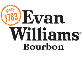 Bourbon drinkers demand consistency, and they are traditionally brand loyal. That’s why the Evan Williams logo doesn’t change, said Chris Ratterman, associate brand manager for Evan Williams Bourbon. When customers see that logo — whether it’s on a shirt, a cap or a hip flask — it assures them that they are getting the same quality in their product with every purchase.
“Evan Williams has been branded over a long period of time,” Ratterman said. “We integrate the logo into everything we do. Every piece of merchandise we sell or give away, we brand it to create that brand identity and to keep everything consistent. It’s a product for the everyday man, so we try to keep it realistic and relatable. We put the seal {Since 1783} next to it to show our heritage.”


